Tag: acrylic painting
-
Happy Hogmanay!
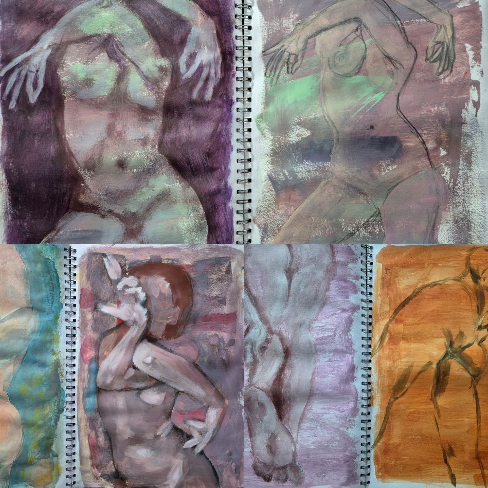
I started the day with ten pages left to fill in this sketchbook, and ended the day with five pages left to fill, and so I’m closer to the end of the book than I thought I was going to be. Happy Hogmanay! Til the morn, Suzanne 683/700
-
Peachy.Keen
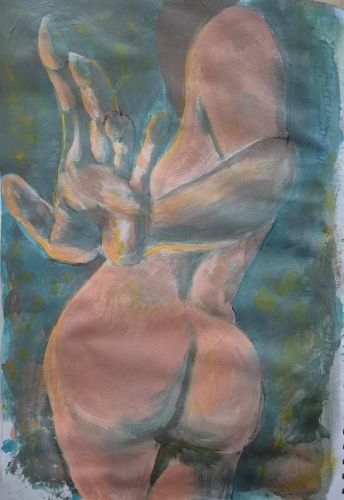
It’s a bit of a rubbish photo because my replacement daylight bulb didn’t arrive and this is Scotland in December so there’s barely any daylight at all. It was painted not quite by candlelight, but at least it was painted. Til the morn, Suzanne 681/700
-
Ten Minutes is Enough
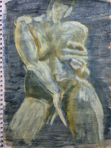
I paint every day, come rain or Santa. Hope he was good to you, if that’s your thing. Til the morn, Suzanne 677/700
-
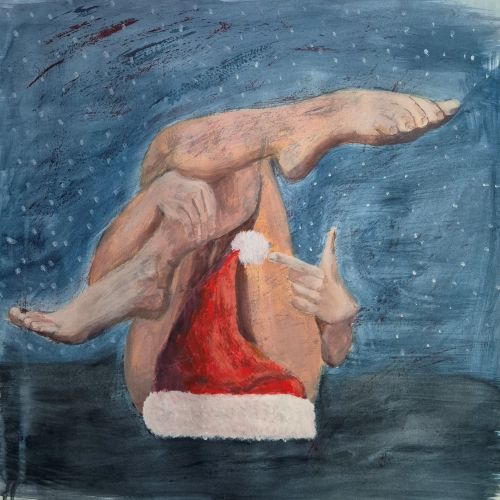
Merry Christmas Eve
Season’s Greetings for whatever you celebrate, thank you for showing up to support my art journey. Til the morn, Suzanne 676/700
-
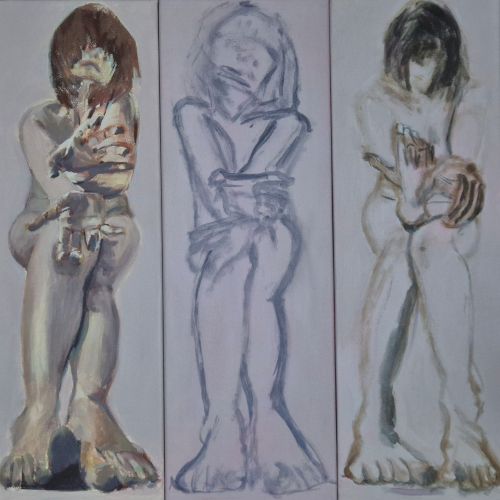
And Then There Were Three
I worked on things that can’t be posted yet, and also brought this triple set on a bit. Til the morn, Suzanne 673/700
-
Revisit and Remix
I spent some time flipping through this sketchbook and making notes on things that caught my eye, and then for this page I combined a few things in ways I hadn’t previously, which gave me some new ideas. Machines can’t do that. Til the morn, Suzanne 672/700
-

The Art of Procrastination
My To Do List is seasonally long, and so today I spent all my time painting, and that is the art of procrastination. As part of my mission to finish one of my A3 sketchbooks before the year is out, I painted these three pages. The To Do list will still be there in the…
-

Canine Intervention
My sometimes lodger on canvas. I will try not to fiddle with this any more, because I could so easily lose the likeness. Til the morn, Suzanne 670/700
-

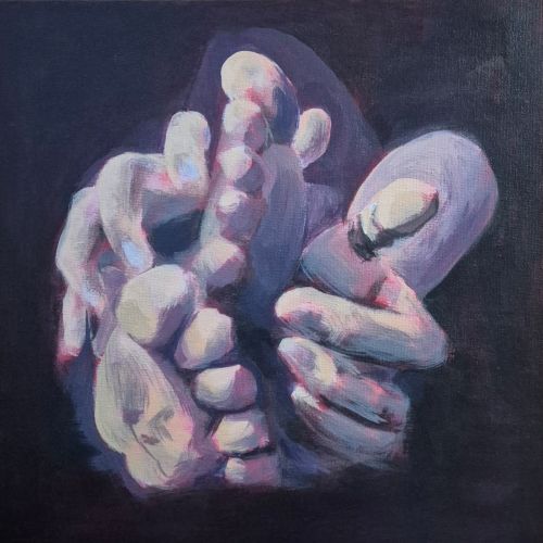
Pile of Digits
Another warm-up sketch, hopefully the secret things will be finished tomorrow, or the next day. Til the morn, Suzanne 669/700
-

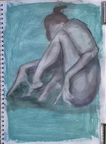
Figure Drawing Filler
I can’t post most of what I worked on today because of the time of year, and things must remain secret, so the least impressive piece is the image for the blog. I was using up some paint for this sketch in my A3 sketchbook, which I would really like to have filled by the…
-

Nearly There
This one is almost, almost finished. Just a couple of tiny adjustments that I am noticing in the photo. The pair to this canvas is needing a bit more work, so I am aiming to finish both tomorrow, which will be a day ahead of the deadline I set myself. Clever me. I suspect the…
-
Dragging Myself to the Finish Line
I am within touching distance of the finish line with this one, and the painting that is its pair. I’m really hoping I can get the finger out tomorrow and resolve both of them. Ran out of daylight again for the photo, but that’s life here in Scotland in December. Til the morn, Suzanne 663/700
