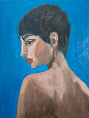
This has come out more blue than turquoise on my phone, but it’s a yummy phthalo turquoise for the background. This is the first layer blocking in values and claiming the page, which is 16×12″ oil paper.
I’m experimenting with a limited palette: phthalo turquoise, phthalo blue, burnt sienna, cadmium red and white. It’s an interesting palette, and I like it, but I think as I progress this I am going to add a yellow ochre, as I think it’s needing a bit more in the skin tones. I’m happy with the first layer, though, it’s a good start.
Til the morn,
Suzanne
712/800

Leave a comment