Yesterday’s photo appears much more blue than the actual canvas, and my phone seems to have a tendency to do that. Today’s pic is much more like it for the background.
This is the first pass of this painting. I’m just playing with the limited palette I chose, and blocking in values. The reference photo is probably not ideal because the subject is in a photography studio, and lit from several different directions, so I’m quite sure I am going to be inventing shadows.
Having finally started, I am enjoying the process.
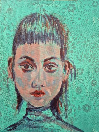
Limited palette: caput mortuum, naples yellow light, ultramarine, pyrrole red, indigo, bright aqua green.
Til the morn,
Suzanne
247/300

Leave a comment