100 Day Project Day 35
I’m on a bit of a deep-dive with tonal values and colour. I know the theory, and the ways artists use it, and how it works. I just haven’t been consciously applying it to my own art making.
I think that might be because I am always wrestling with the idea, consciously or unconsciously, that those sorts of things are for “real artists”. I also wonder if I developed a Thing where finishing pieces became Very Important, and so I got very into fast faces created in less than an hour, and my process has developed to something else.
I’m noticing this year that not finishing a thing immediately isn’t such a big deal, because who exactly is counting? I’m also finding that I am finishing things, and liking more of the things I finish, even if they take a while to be finished, usually because of periods of inactivity on the piece as procrastination settled in.
I digress, back to values and colour.
I was flipping through some old work, and I came across this piece which I made in July 2022.
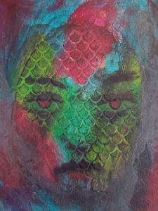
I remember really loving the process, and the concept that I started out with, and the way it came together, but once it was finished I felt that it just didn’t quite translate. It was too dark.
I was thinking about using this little painting as a jumping off point for something new, so I’ve been looking at it and musing about what I would do differently.
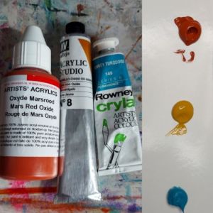
Today I pulled out my colour workbook, and grabbed three colours. I specifically didn’t choose obvious primary colours, because that wasn’t what I was interested in exploring. Instead I chose yellow iron oxide, mars red oxide, and eventually settled on turqoise for the blue slot.
Imagine my surprise that I chose a turquoise. Ha.
The challenge I set myself was to mix colours with these three, and see if I could pick out the values, before taking a photo and switching it to greyscale to see how well I had done. Another way of doing this is looking through a piece of red perspex.
Here are the colour swatches:
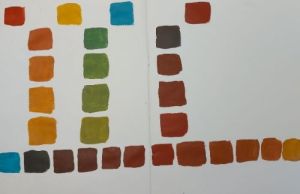
I was correct with which colours filled the lightest light spots, and the darkest dark spots, but it was interesting to see how the midtones were harder to discern from each other when I removed the colour cue. I also observed that the mars oxide red came up darker than the turquoise.
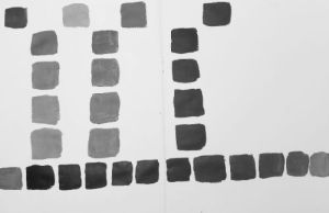
Here’s how the colour swatches look in greyscale:
While I was doing the greyscale exercise on my phone with my colour swatches, I took my snake woman piece and gave her the same treatment.
Here she is before and after:
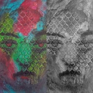
What’s interesting to me is that while the original piece looks too dark, when I flip it to greyscale, the image shows a majority of mid-tones, and the values are all quite close together.
Now, for myself, I like this little piece because I wanted the effect of this face emerging from the dark, so she’s fine as she is, but if I wanted to use her as a reference for something new, I would want to give her more of a pop with my choice of colours and values.
If nothing else, she is very useful for illustrating the way colours that look dark aren’t necessarily creating intertest and focus in terms of tonal value. The darkest dark on her face is around her mouth, when her eyes are the place I would want to draw the eye.
If I’m going to make a new snake lady, she will have much more contrast, more darkest dark and lightest light, around the eyes.
Til the morn,
Suzanne

Leave a comment